


Personalizing the iOS Battle.net mobile app by designing a filter feature that better surface expected game titles.
Background
Lack of customization ⚠️
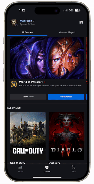
Battle.net mobile does not have a feature for players to navigate between all games and games they own/have played recently in the game library, unlike the Battle.net desktop app which is more advanced in its designs as players use it more.
My task was to create a first version of game filters for the mobile app that mirrors the game navigation that appears on the desktop app, for a more personalized user experience.
Competitor Analysis
Mobile filteration experiences 📱
I conducted brief competitor analysis to understand best UX practices for filteration and toggling experiences. I looked at Steam and Amazon as they have a lot of products where users need filters to navigate through them.
I also analyzed the current app experience, noting how users currently navigate through the app, any filteration systems that exist, and the current UI design system in place to help inform my own design decisions.
Low-Fidelity Prototypes
Early Concepts 🧑🎨️
After competitor analysis, I began designing low-fidelity prototypes and exploring different potential user flows of how the user would filter 'All Games' and 'Recently Played' games. The most challenging part of this process was how to translate the existing desktop app designs into mobile.
I designed four different low-fidelity prototypes and presented these to a senior product manager for initial feedback. Together, we eventually landed on having users filter through tabs as it was the most consistent with the existing pages on the app.


Design Team Feedback
Iterating on feedback 👥
After discussion with the PM, I asked for design feedback from my design team to further refine my low-fis.
The team all agreed that the tab functionality was the most consistent with the current app experience.
One piece of feedback I received was concerns with localization. In some languages like German and Korean, the words and number of games would not fit on one line.
The number of games at the top look like notifications, which may confuse a user.
I did not consider these issues in this part of my process, so I ensured these were all addressed in my next designs.
On top of the main task, I wanted to also explore future iterations of the filter feature, considering aspects like scalability.
Future Scalability
Additional Filters 🔍
At the same time as designing V1 of this filter feature, I wanted to design a future version where the filters on desktop AND mobile are the same, such as 'Start for Free' and 'Mobile'.
My main concern with the filter tab design is future scalability, and what it would look like if the additional filters from the desktop app design were added. I challenged myself to design for this concern.


Low-Fidelity Prototypes
Final user flow
I took the feedback from my design team, and landed on this low-fi prototype as my preferred design for the mobile app filters. I addressed the main concern of localization by bringing the number of games underneath the filter tabs so there is more space for the two elements.

Cross-Functional Collaboration
Developer builds 🧑💻️
Below is a developer build created by one of the mobile app engineers based on my filter tab design. It was a cool experience seeing what my design would look like if it were implemented onto the app!
That's a wrap!
Overall Key Learnings
Designing a feature for mobile
The importance of low-fis and user flows to creating cohesive experiences
Understood the importance of localization for large-scale apps
If I had another three months…
I would want to continue developing this feature, and work with the engineers and PM to learn more about the end of the cross-functional design process for mobile.
This was a fun smaller task that I was assigned during my Blizzard internship, to gain experience designing for mobile on top of my main desktop project. The design process was faster than my main project because it was an already existing system, but it was still a challenge in terms of creating a smooth user flow!