
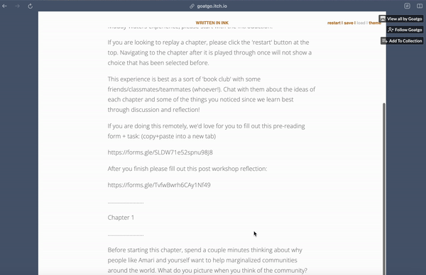
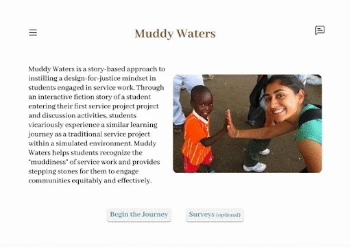
The Old Experience
Too much text!
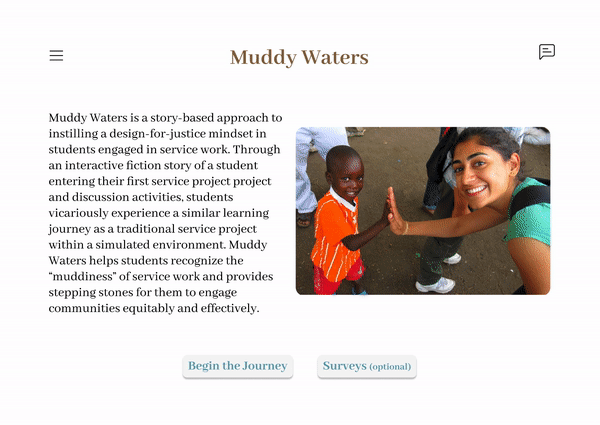
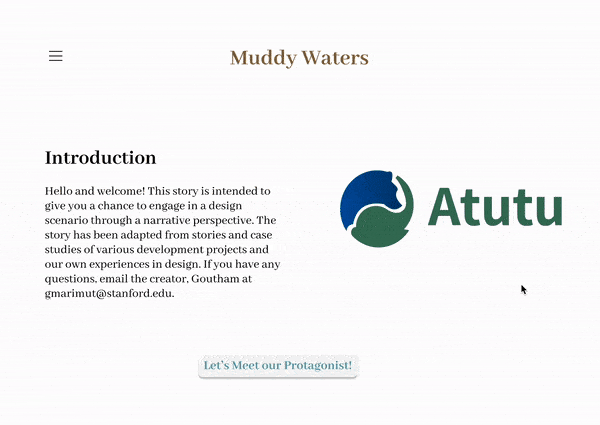
My team was tasked to redesign a training module called “Muddy Waters” for Atutu, a non-profit organization featured in Forbes. The module is in a choose-your-own-adventure/interactive fiction format, teaching students about:
how to carry out the community-centered design process
åworking with international stakeholders
and the importance of a design-for-justice mindset.
Atutu’s previous training model was very text-heavy, lacked engagement and immersion, and there is an inability to annotate or synthesize information.
Walkthrough of the current website.
Competitor Analysis
Identifying gaps in existing products 🔎
At the same time as primary research, I was responsible for competitive analysis of other community design education tools. I carried this out as I felt it was important to understand what kind of resources were out there and what our website redesign should and should not include. Looking at direct competitors, I found that current design education tools provide informative definitions and guidelines, but do not teach how to actually apply these to real problems.

Examples of design education competitors
Competitor Analysis
An excuse to watch game playthroughs 🎮
My biggest takeaways from analyzing existing interactive fiction games were 1) engaging interactive fiction games had minimal text presented to a user at a time, and 2) interactive features are very visible to the player so that the player can intuitively interact with the game for a seamless experience.

Assemble with Care (puzzle video game)
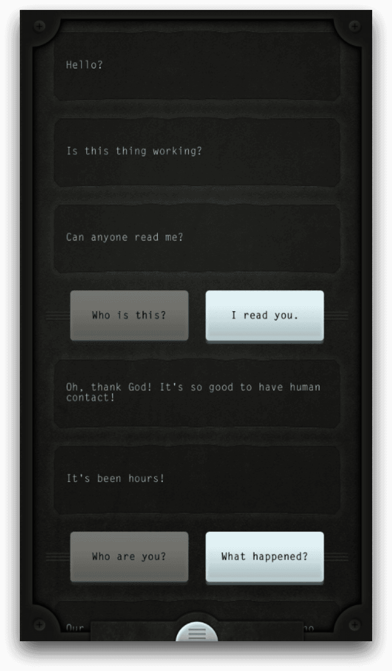
Lifeline (text based adventure mobile game)
Defining the problem
How might we...
design an engaging and informative community-design training tool for design students and educators?
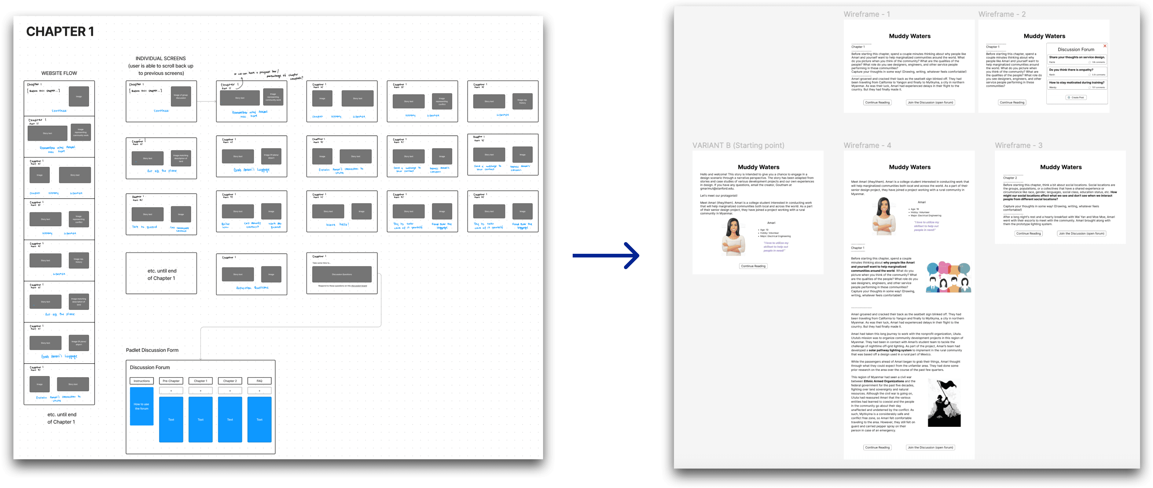
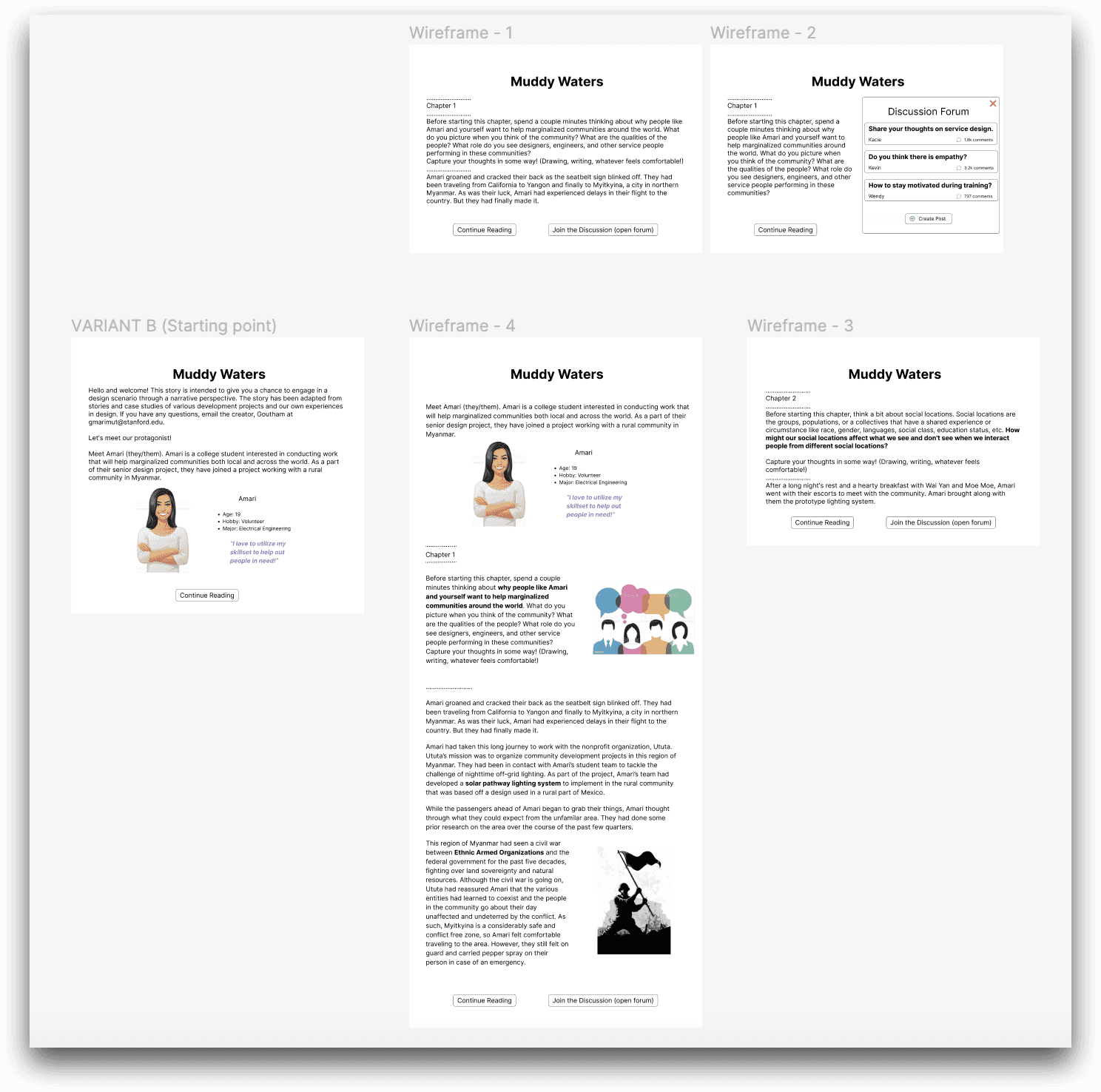
Low-Fidelity
How to tell a story 🖌
I began to sketch and create wireframes for a redesign of the training module, focusing on improving its storytelling. This set of sketches were heavily inspired by the interactive fiction games I analyzed in my competitor analysis research:
I separated the larger chunks of text into smaller more comprehensible pages.
I added accompanying images that match the text, and increased visibility of the buttons.
The interaction between type-ahead filter and search filters
A/B Testing
Increased imagery = increased engagement 🖼️
My team's hypothesis: Incorporating visual aids to the existing module, and breaking up the text into more comprehensible chunks will increase user engagement.
Key Findings 🔑
Interviewed 17 UC San Diego undergraduate and graduate students
15/17 participants preferred redesigned module over original, more engaging and immersive
15/17 participants found visual elements made module more desirable to use

Version 1
Version 2
Design Obstacle
Conflicting Stakeholder Needs ⚠️
One problem we faced during our design process was conflict of interests between low power and high power stakeholders.
From our interviews with Atutu's cofounders, they were hesitant on adding images to the module because they did not want the module to create false preconceived notions of Southeast Asia/international communities and avoid any assumptions. However, from our A/B testing the large majority of our undergraduate participants preferred more visual aids for better engagement and immersion.
So how did my team address these clashing needs from different stakeholders?
vs.
Solution
Striking a balance ⚖️
Our solution was to balance the preferences of our stakeholders by using vector illustrations.
We chose these types of visual aids because they not only prevent assumptions about international communities, but also help end users of this module be more engaged with the content. We received positive feedback from Atutu’s cofounders, and got approved to implement these vector illustrations into our final prototype.

We designed a more engaging, and immersive user experience for the training module. We achieved this by the inclusion of images, a notebook feature to reflect on the content, and a discussion board to collaborate with other students.
Visual Incorporation 🖼️
One main impact I had on the final deliverable was the incorporation of vector elements as visual aids throughout the storytelling experience and breaking the text up into smaller chunks. Based on our data from user research and testing, this redesign creates a more immersive and educational experience.
Improved Navigability 🔎
Another impact I had was enhancing the navigation of the training module. I designed the story caption buttons to be more visible, and added icons such as a hamburger menu.
With these functional changes users would have an easier experience going through the module, contributing to a better learning module experience.

That's a wrap!
UX design as a tool for social impact 🖌️
This class project was such a unique way for my team to engage with a non-profit organization and make an impact.
In the process of creating this educational training module, I also ended up learning about international design and community-based design. I also learned the importance of allowing the community to take ownership of this project instead of only designers. My team's design choices were fully guided by the non-profit and the findings from our users.
If my team had more time to work on this project, I would love to conduct a second round of user testing on this current prototype we created and also begin implementing this into an actual website by collaborating with web developers.